How UX/UI can help deal with the COVID-19 Pandemic?

How UX/UI can help deal with the COVID-19 Pandemic?

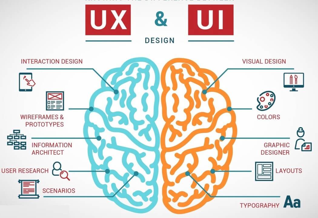
As the globe grapples with the COVID-19 pandemic, it has become imminently important for the American public to receive accurate and timely information on the progress of the battle against the virus. As of yet, there is no single, central authoritative source of information for the public to know what to do during this crisis. As a UX Professional with over 15 years experience serving the UX needs of State and Federal Agencies, I would like to share a few ideas on how User Experience and User Interface (UX/UI) best practices can be used to create a site that can best serve our citizens in these trying times. 

So What is UX/UI?

UX/UI refers to User Experience/User Interface. These are two separate disciplines but are often lumped together. User Experience deals with all the work related to ensuring that a user can successfully accomplish the task that is needed. User Interface, on the other hand, refers to the development of the elements of the interface that user has to use to do said tasks. They are related, but they are not the same. See the diagram below for examples of task specifics.

9 UX/UI Ideas for a Pandemic Information Portal

1. Authoritative Design

There is a lot of fake news circulating on topics concerning the COVID-19 Pandemic. A centralized resource with accurate information is necessary. But for users to trust this site, the first consideration, even beyond the content is its design. This site needs to look the part. It needs what I would call “Authoritative Design”. Here are a few of the elements that I would consider.

  • A clean subdued color scheme built on a palette of Blue to White. Color Psychology research has shown that blue elicits feelings of calmness and serenity. It is also a color strongly associated with authority and security.
  • This site should clearly display the logos of the federal and private partner websites.  The logos should link back to the partner sites and lead to a landing page that outlines the contribution of said partner to the overall effort.
  • The source of the information published, must be stated and linked so that users can do additional research if they so desire. All these sources should be high quality. If the source is an individual, users should be linked to a profile that lists his or her qualifications.

2. Audience Pages

This portal will undoubtedly have a huge amount of information, all of which does not apply to every individual visiting the site. One way to organize this information is to divide the content into Audience Pages. Each group of pages will have content that applies to a single audience. These groups will be verified by user research. Here are a few examples of potential risk groupings:

    1. Medical Risk Audiences: This would have information for individuals based on the presence of pre-existing conditions. 
    2. Employment Risk Group: One’s vocation is a significant risk factor for contracting the virus. Job specific best practices can presented to the users.
    3. Age: As different age groups have different risk profiles, users should able to enter their age and have returned to them relevant information returned to them.
    4. Location: Users will be able to view information based on their location. This can include testing sites, closings, infection rates, etc. 

3. Plain Clear Language

Epidemiology is a very complicated topic. It is often difficult to communicate key ideas to users who do not have a fundamental understanding of virus biology.

    1. Efforts should be made to ensure that all language should be clear and sentences simply constructed. All content should be at the 8th grade reading level.
    2. If complex terms have to be used “Info Bubbles” with definitions of these terms should be included.

4. Maps + Geolocation

With pandemics, geographical information is very important. Thankfully, we already have excellent tools available to build web-based tools like the following:

    1. Service Location Finders: Users would be able to use these to find the locations and directions of various medical service centers, supply depots, etc.
    2. “Busyness” and Capacity Measures: User cell phone location density sensing can be used to display the relative busyness of a target site and when balanced with stated capacity of these facilities, wait times can be determined.
    3. Geographical Data Visualization: Mapping API’s can be used to visually display important content to users who are interested tracking the progress of the pandemic. 

5. Visualization

Communicating complex processes is a difficult task in the best of circumstances. But when the stakes are as high as the health of an entire planet, visualizing complex processes should be used to increase the accuracy of idea conveyance. Effective visualization also takes the place of time intensive and expensive language transitions.  Here are a few processes that are visualized: 

    1. Hand Washing Techniques: Demonstrations of the hand washing process in medium fidelity for both adults and children should be produced.
    2. Virus Life Cycles: Medium fidelity diagrams showing the virus life cycle can provide public awareness when as to when they are potentially most infections.
    3. Virus Transmission Process: Viruses have several transmission methods and a visual representation is great for showing how individuals can reduce the risk of it spreading as well as how to protect themselves when go out in public.   
    4. Testing Process: Some countries have developed sample collection protocols, such as the Drive-Thru Test Site, self testing etc. Including visualizations will be the perfect way to show the user the correct process.

6. Decision Support and Adaptive Process Paths

In times of stress, decision support tools are very effective in eliminating unnecessary options and focusing the user on the task at hand. After sufficient task analysis, interfaces can be developed that can guide users through processes like the following:

    1. Triage: A visual pathway can be developed to help users decide if they need to get tested for COVID-19 or if they have the flu.
    2. Self-Quarantine: A visual decision tree can be developed to help users take the proper steps when setting up a home quarantine based on their living conditions. 
    3. Selecting A Service Center:  A decision guide can help users select the best medical service center based on important criteria like services offered, wait times, distance, visitor policy, child friendliness, etc.
    4. Supply Estimators: Calculators can be used to help individuals and families calculate their supply needs in case they need to ”shelter in place” for an extended period of time.

7. Section 508 Compliance  and Accessibility

This site must be accessible to all individuals who may need this information. All Section 508 rules and accessibility best practices should be followed to ensure the most vulnerable of our community have access to these resources. These practices include the following:

  • A text equivalent for every non-text element.
  • Equivalent alternatives for any multimedia presentation shall be synchronized with the presentation e.g. Closed Captioning for Videos.
  • Web pages shall be designed so that all information conveyed with color is also available without color, for example from context or markup.
  • Pages shall be designed to avoid causing the screen to flicker with a frequency greater than 2 Hz and lower than 55 Hz.

8. Responsive Design

Responsive design refers to the ability of a website to resize and reformat itself based on the size of the screen it is being viewed on. This site should be able to accommodate mobile phones, tablets, laptops, desktops, and television screens and display its contents optimally. 

9. Notices

This site should have an effective system of visual notices that will alert users to new developments on the progress of the pandemic and quickly lead them on to the details of the update. These notices should also communicate the importance of the update.

In Conclusion

This list is not at exhaustive. It is just an initial look at what UX/UI best practices can do help with the dissemination of accurate information to public in this time of uncertainty. If you have any questions don’t hesitate to contact me using this form. You can also leave a comment below or email me at lesterajones@gmail.com.

Prev Ram 1500 Overland Build - Inspiration
Next COVID-19's Baltimore - Part One

4 Comments

Leave a comment Cancel reply